NODO’S NEW VISUAL IDENTITY
An interview with Design Studio Common Kind

In 2016, I embarked on an exciting journey by founding Nodo, a brand initially focused on crafting vibrant, textile-knotted jewellery and accessories. At the time, my passion was solely driven by a desire to create chunky colourful pieces and Nodo’s branding mirrored my own bold and colourful personality.
By 2018, my journey into jewellery and accessories making had evolved to include metalwork, expanding my skills and embracing the reality of turning an hobby into a small business. The pivotal year of 2023 marked a significant shift for Nodo, as I decided to concentrate exclusively on metal jewellery. This decision was influenced not only by a desire to specialise but also by the evolving tastes and requests of my clients.
As Nodo and I have grown together, the brand has become an inseparable part of my life and a true expression of my craft. It became increasingly clear that Nodo’s original branding no longer aligned with my evolved vision and required a transformative update.

That's when I met Martina, the creative force behind Common Kind. Her knowledge and vision were immediately apparent, and she played a crucial role in guiding Nodo through this transformation with unwavering passion and expertise.
In September, we unveiled Nodo’s revamped image, featuring a new logo, brand identity, and website. While many of you have already seen these changes, there’s a deeper story behind our rebranding efforts.
I’ve invited Martina to share insights into the concepts, challenges, and behind-the-scenes processes of this significant transformation. Enjoy the interview!

HOW DID YOU START THE BRANDING PROCESS FOR NODO?
“For me, branding is a process that has as much to do with logic than it does with creativity. My process always starts from a strategic place: the first step is to carry out a thorough review of the brand's competitors, to get a better understanding of the market in which the brand operates. From there, we can start develop a Brand Strategy, to identify the brand's unique positioning and strengths, and how these should be communicated to the target audience. The ultimate goal is to stand out from the competition.”
WHAT YOU WANTED TO ACHIVE AND THE TOOLS YOU’VE USED TO DO IT?
“With Nodo in particular, the ambition was to elevate the look and feel of the Brand, to align it with the high quality and aesthetic value of the products. It was essential to convey a sense of craftsmanship, and a Brand that is modern but timeless at the same time. From the competitor's analysis, I learned that most brands in the mid-to high end market have a very minimal, stripped back identity – almost to the point of looking all a bit samey.
The strategy was then to embrace this minimal look, but endow Nodo's identity with a mark that was highly ownable and distinguishable, that would make Nodo stand apart. This idea led us to explore a monogram, a graphic device that is particularly used by luxury fashion houses (think YSL, Chanel, Louis Vuitton etc.). Borrowing this visual language from the luxury world helped elevating the look of Nodo, whilst giving it an ownable asset.”
WHAT’S THE STORY BEHIND THE LOGO-MONOGRAM?
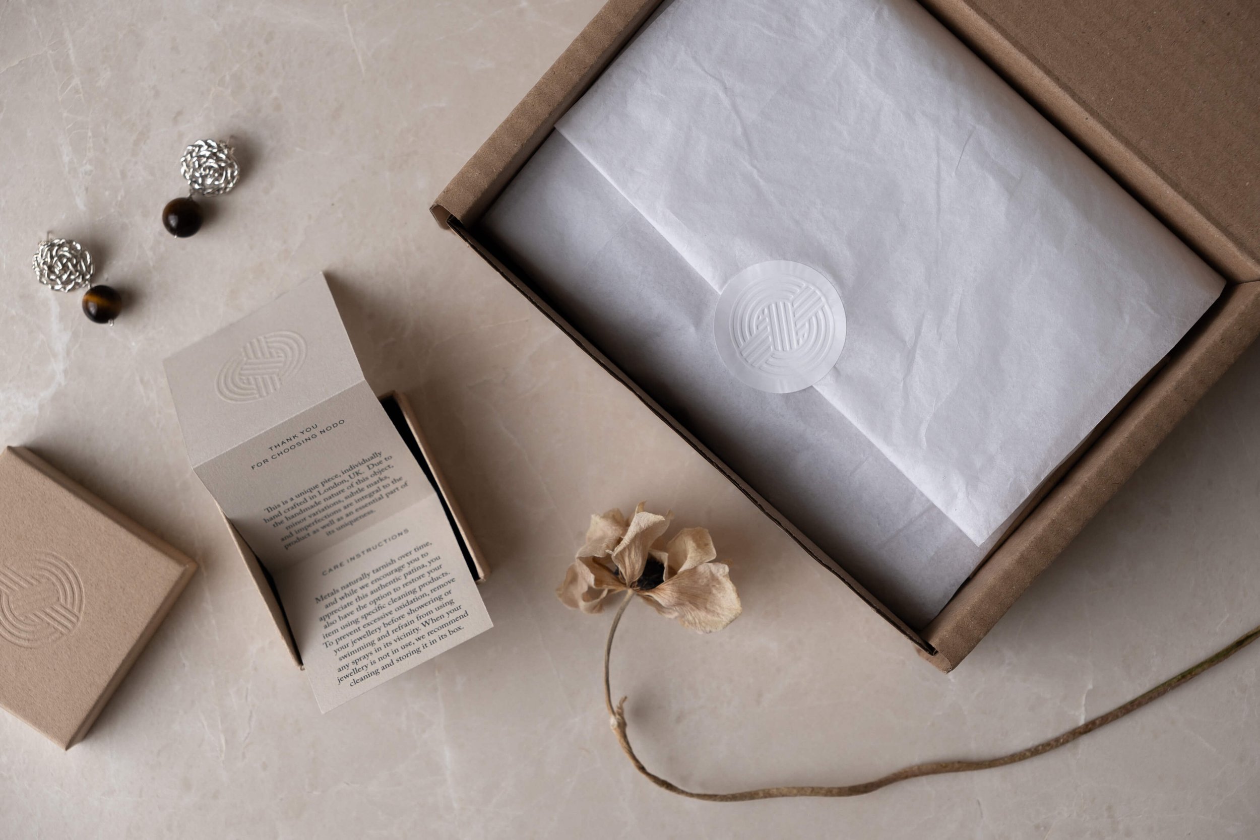
As Nodo means 'knot' in Italian, I was keen to explore how we could communicate this theme from a typographic point of view. The inspiration came from Mizuhiki Rocks (also known as Zen Stones) an ancient Japanese art consisting of weaving cord or fibres around rocks in a knotted formation. If you look at the monogram attentively, you will spot all the letters composing the word 'Nodo' intertwining in a knot.
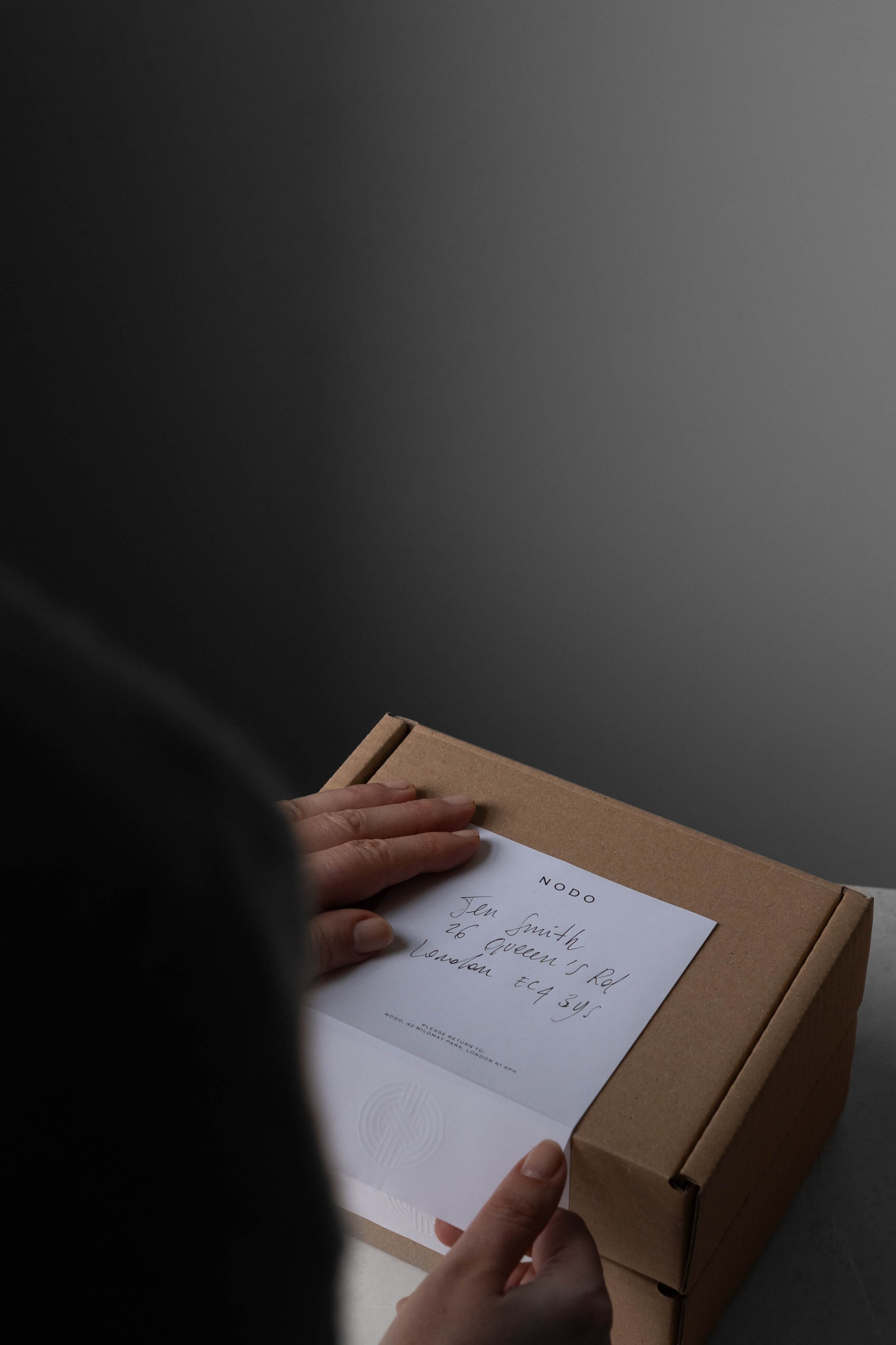
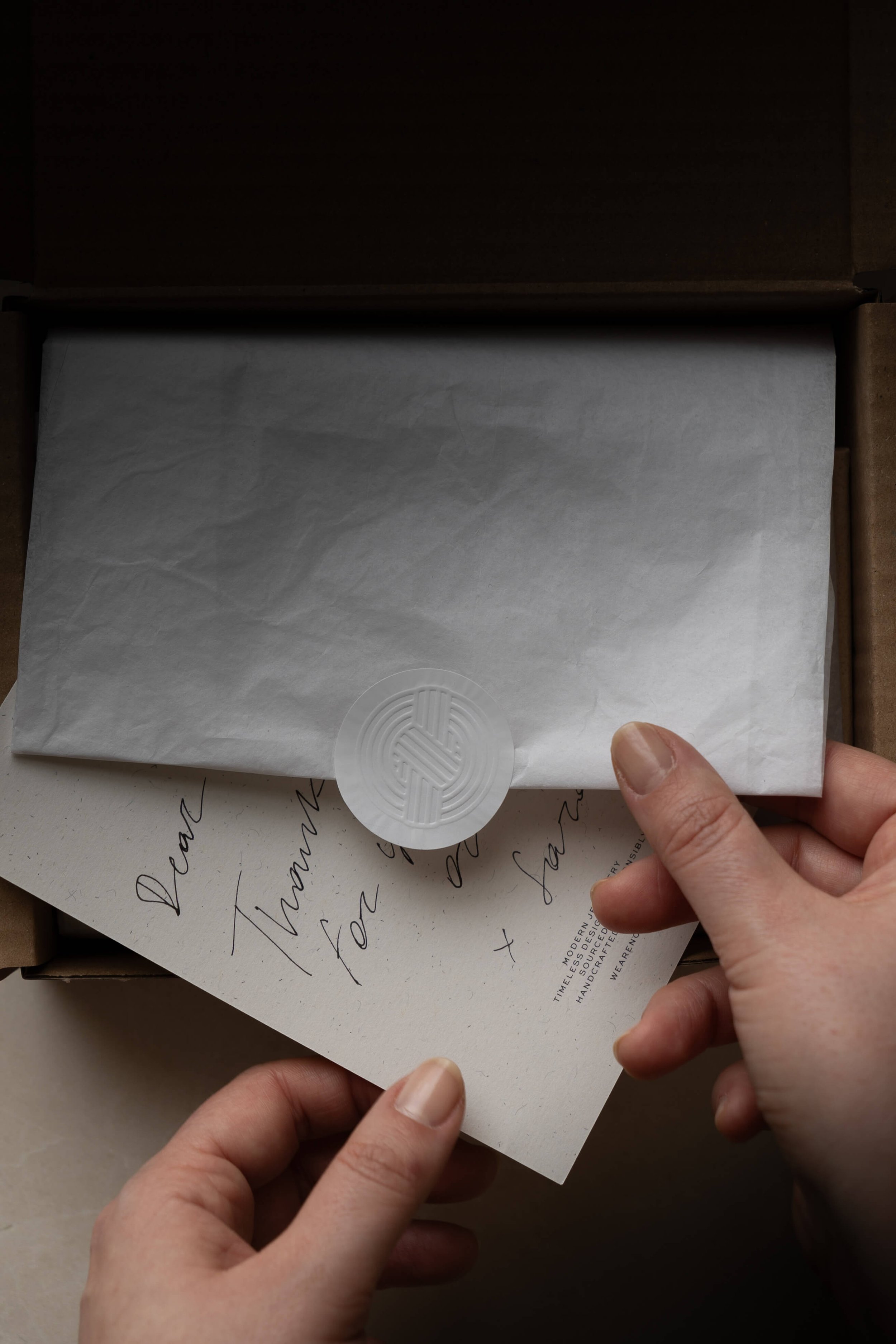
The lines composing the mark are intentionally imperfect and imprecise, to convey the handmade quality of Sara's beautiful pieces. Finally, using finishes like blind emboss and deboss really helps elevating the brand, whilst also giving the packaging a tactile quality that enhances the client's experience.
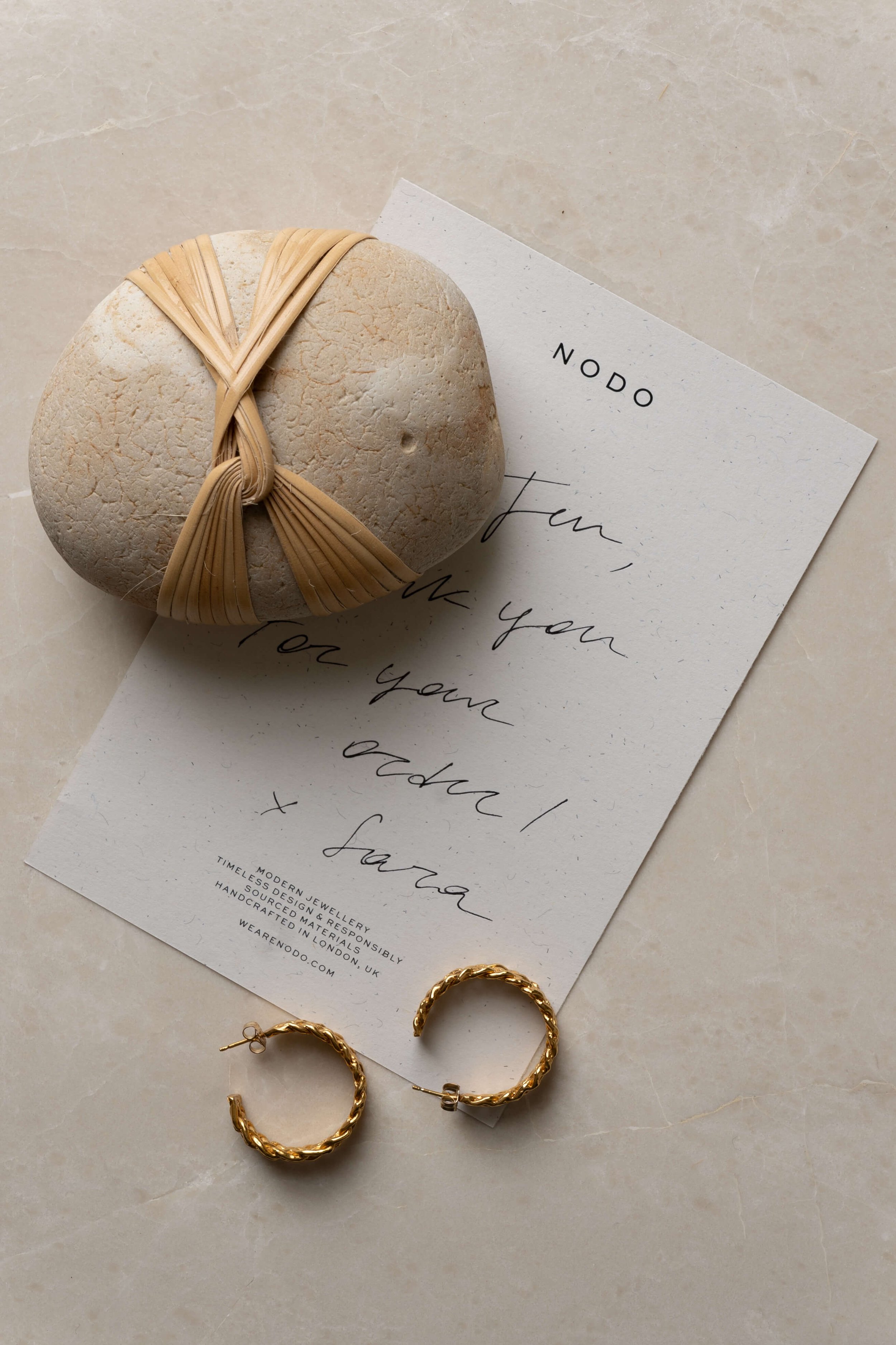
The rest of the identity is fairly neutral, with a simple and slightly extended Sans Serif as the display font, paired with a timeless serif like Caslon as the workhorse. Finally, the colour palette was inspired by Sara's beloved cat Bruno, whose warm beige fur provided the perfect inspiration for a classic and neutral backdrop to Nodo's collections.
Follow @commonkind.studio or get in touch
All images are by ©Common Kind
